Responsive design refers to a website design that adjusts its layout and content to fit different screen sizes and devices. User-friendly design refers to a design that is easy to use, understand, and navigate for the user.
In today’s digital age, it’s crucial for a website to be both responsive and user-friendly. With the increasing use of mobile devices to access the internet, having a responsive website ensures that your website can be easily viewed and interacted with on any device. On the other hand, a user-friendly design helps improve the overall user experience and can increase engagement, conversions, and customer satisfaction.
In this blog post, we’ll provide tips and best practices for designing a website that is both responsive and user-friendly.
Tip #1: Keep the Design Simple and Clean
A simple and clean design is one that is uncluttered, minimalistic, and easy on the eyes. It focuses on the essentials, making it easier for users to find what they’re looking for and interact with the website.
A simple and clean design can help improve the user experience by making the website easier to navigate and read. It also helps to convey a professional image and can increase engagement and conversions.
To implement a simple and clean design, use a limited colour palette, stick to a consistent font style, and avoid clutter by only including essential elements on the page.
Tip #2: Choose the Right Colors
Colour psychology is the study of how colours impact human behaviour and emotions. In web design, the right colour choices can help create a desired mood, attract the right audience, and make the website more appealing.
Choosing the right colours for your website can help improve the overall user experience and increase engagement. The right colours can also help to convey a desired brand image and make the website more memorable.
When choosing colours for your website, consider your target audience, brand image, and desired mood. It’s also a good idea to use a colour palette that is consistent across the website.
Tip #3: Make Navigation Easy and Intuitive
Navigation refers to how a user moves around the website and accesses its content.
Easy and intuitive navigation can help improve the user experience and increase engagement by making it easier for the user to find what they’re looking for. It also helps to create a professional and trustworthy image for the website.
To implement easy and intuitive navigation, use a clear and consistent navigation structure, label the sections of the website clearly, and make sure that the navigation is accessible from all pages.
Tip #4: Use Large and Clear Typography
Typography refers to the style and appearance of the text used on a website.
Large and clear typography can improve the readability and overall user experience of the website. It also helps to convey a professional image and can increase engagement.
To use large and clear typography, choose a font that is easy to read, use headings and subheadings to break up the text, and make sure the text size is large enough to be easily readable, especially on smaller screens. It’s also important to consider line spacing and letter spacing to improve readability.
To use large and clear typography, choose a font that is easy to read, use headings and subheadings to break up the text, and make sure the text size is large enough to be easily readable, especially on smaller screens. It’s also important to consider line spacing and letter spacing to improve readability.
Tip #5: Optimize Images for Speed and Responsiveness
Image optimization refers to the process of reducing the file size of images to improve the speed and performance of the website.
Optimizing images can help to improve the speed and performance of the website, especially on slower internet connections. It also helps to create a better user experience by making the website more responsive and less frustrating to use.
To optimize images, use the right file format, reduce the file size, and use responsive images that adjust to different screen sizes and devices.
Tip #6: Make the Website Accessible to Everyone
Accessibility refers to the design and development of a website to make it usable by as many people as possible, including those with disabilities.
Making the website accessible can improve the user experience for a wider audience and can increase engagement and conversions. It also helps to create a professional and trustworthy image for the website.
To make the website accessible, use clear and descriptive language, provide alternative text for images, use proper headings, and ensure that the website is navigable using only a keyboard.
Tip #7: Use White Space Effectively
White space, also known as negative space, refers to the blank areas between elements on a website.
Using white space effectively can help to improve the readability and overall user experience of the website. It also helps to create a clean and professional image for the website.
To use white space effectively, use plenty of it, make sure the elements on the page have enough breathing room and avoid clutter by only including essential elements on the page.
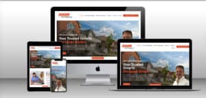
Tip #8: Use Responsive Design
Responsive design refers to a website design that adjusts its layout and content to fit different screen sizes and devices.
Using responsive design can improve the user experience by making the website easier to view and interact with on any device. It also helps to create a professional and trustworthy image for the website.
To use responsive design, use flexible grid-based layouts, make sure the images and other media are responsive, and use media queries to adjust the layout for different screen sizes and devices.
Tip #9: Test the Website on Different Devices and Screen Sizes
Testing the website on different devices and screen sizes helps to ensure that the website is responsive and works correctly on all devices.
Testing on different devices and screen sizes can help to improve the overall user experience and can identify any issues that need to be addressed before the website goes live.
To test the website on different devices and screen sizes, use real devices and emulators, use responsive design testing tools, and get feedback from users to see how the website works for them on their devices.
Tip #10: Keep the Website Up-to-Date
Keeping the website up-to-date refers to regularly updating the content, design, and functionality to ensure that it remains relevant and user-friendly.
Keeping the website up-to-date can improve the user experience, increase engagement, and help the website rank better in search engines. It also helps to maintain a professional and trustworthy image for the website.
To keep the website up-to-date, regularly review and update the content, design, and functionality, test the website on different devices and screen sizes and get feedback from users to identify areas that need improvement.
—–
In conclusion, these 10 tips can help you to design a website that is responsive and user-friendly. By following these tips, you can create a website that provides an optimal experience for your users and helps you to achieve your goals, whether it’s to increase engagement, generate leads, or sell products.


