Project Overview
Client: Victim Services of Peterborough & Northumberland (VSPN)
Services: Brand Identity, Logo Design, Website Design & Development
Goal: Transform VSPN’s visual presence into something that reflects the compassion they offer—so people in crisis can find help without hesitation.
Result: A cohesive brand and website that feel safe, clear, and deeply human.
 What We Were Up Against
VSPN’s old logo looked like a police badge. That might have worked years ago, but it sent the wrong message now. For someone seeking help after trauma, that visual felt more like a barrier than a welcome.
Their website had similar issues. The information was there—resources, contact details, programs—but buried under heavy text and confusing navigation. It read like policy documentation when it should have felt like a conversation. Executive Director Emily Poulin knew they needed more than a refresh. They needed a complete shift in how people experienced their organization online.
We started with one question: What does safety look like?
How We Got There
Emily told us early on that four values defined everything VSPN does: compassion, empowerment, connection, and hope. Those became our foundation. Every design choice traced back to at least one of them.
Rebuilding the Brand from the Ground Up
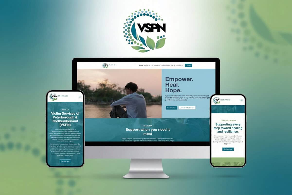
The badge had to go. In its place, we created something softer—a circular emblem built from dots and leaves. The dots represent people coming together. The leaves suggest growth and renewal. The open circle signals inclusion, the kind that says you belong here, and we’re here to help.
Colour mattered just as much. We moved away from harsh navy and chose a palette anchored in deep teal (for stability), sky blue (for empathy), and soft green (for healing). Together, they create a sense of calm without feeling cold or clinical.
For typography, we landed on Jost—a typeface that balances warmth with professionalism. It’s readable, accessible, and doesn’t feel institutional. During our first design review, Emily said the new look “felt like a fresh start.” That’s exactly what we were aiming for.
We help nonprofits like VSPN tell their stories with clarity and compassion.
Designing a Website That Puts People First
The homepage had always been well-intentioned. But intention doesn’t help someone in crisis who can’t figure out where to click. We rebuilt the VSPN website in WordPress with one priority: make it easier to find help, fast.
Every element was chosen for usability and emotional safety. Clean layouts. Intuitive navigation. Colours that invite instead of overwhelm. We separated community-facing services from internal administrative content so visitors wouldn’t have to wade through irrelevant pages.
We also added an Escape This Page button—a discreet feature that lets someone leave the site instantly if they need to. It’s a small detail, but it signals that we understand the stakes.
Calls-to-action now guide people directly to contact forms and critical resources. And we built the entire site with accessibility and SEO best practices baked in, so VSPN can reach more people who need them.
What Changed
The transformation was immediate. Staff noticed it first—they finally had a digital presence that matched the care they bring to their work. Community members noticed it too. The site didn’t just look better; it felt better.
Visitors now find what they need faster. The design removes friction and replaces it with reassurance. Emily had told us she wanted the site to “feel like a safe space.” That became the benchmark for every decision we made. Typography, spacing, button placement—all of it built toward that single goal.
The new brand travels well, too. Whether someone sees it on a business card, a social post, or the homepage, the message stays consistent: We’re here. We care. You’re not alone.
One team member mentioned during the final walkthrough that they felt proud sharing the website now. That’s the kind of outcome metrics don’t capture—but it’s the one that matters most.
What We Learned
Brand and web design work best together. When the logo and website share the same visual language, the emotional impact multiplies. People don’t just recognize your organization—they feel it.
Accessibility isn’t optional. Every choice—color contrast, button size, navigation flow—was made to ensure anyone could use the site, regardless of ability or circumstance.
Design should calm, not impress. Flashy visuals might win awards, but they don’t help someone in crisis. We prioritized clarity and comfort over cleverness.
Your work deserves to be seen clearly. VSPN was doing incredible work long before we showed up. Our job was to make sure their digital presence reflected that reality—so the people who need them most can find them without struggle.
Your Turn
If your nonprofit’s message deserves a clearer, kinder voice online, let’s build something meaningful together.
Get a Quote to start creating a brand and website that reflects the heart of your work.


